 Sylvia Chebet
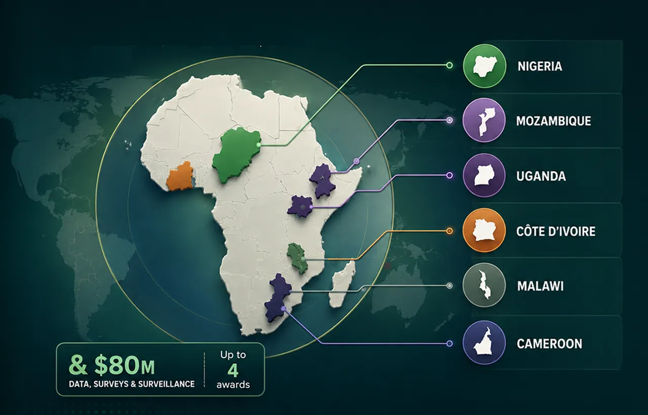
When delegates at the International AIDS Conference in Rio de Janeiro saw Nigeria shown as a landlocked country, Mozambique moved to the Horn of Africa and Côte d’Ivoire shifted into Southern Africa, many initially thought it was a joke.
It was not.
The map appeared in a presentation by the US delegation during discussions on global health assistance. After images circulated on social media, the US State Department acknowledged what it called “an unfortunate error” and accepted responsibility for the confusion and misrepresentation caused to African partners.
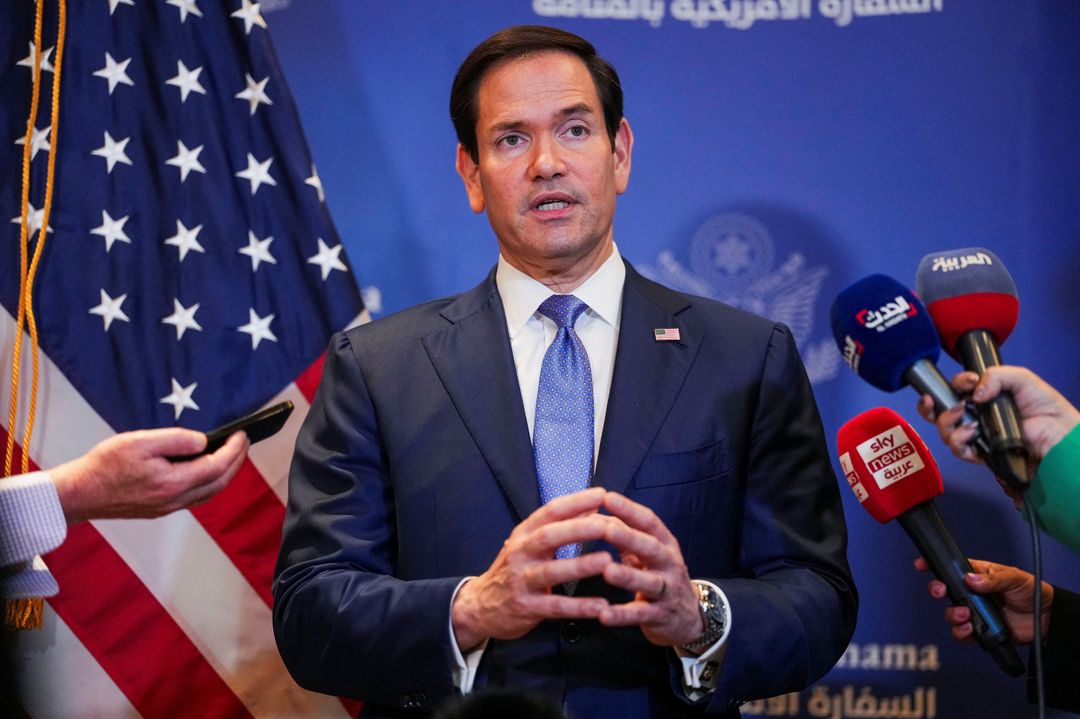
According to the department, a staff member had hastily modified the slideshow shortly before the presentation. But for many observers, the controversy was never only about a misplaced map.
“The obvious failure was human — nobody cared enough to check,” Moky Makura, Executive Director of Africa No Filter, told TRT Afrika.
“The bigger question is what the AI was drawing on to get every country wrong. AI is only as good as what it knows. And this wasn’t someone playing with AI at home; this was a powerful institution presenting at a global conference. When bad information is generated and legitimised at that level, the repercussions can be far-reaching.”
Makura wrote on a LinkedIn post that she had asked AI to generate a map using the same countries and it placed them correctly, suggesting the problem was not simply that artificial intelligence cannot map Africa accurately.
“So the question I would like answered is what data is the US State Department feeding its chatbots about Africa,” she wrote.
“This is evidence that AI is only as good as the people using it and the data they’re feeding it. If something as basic as the location of African countries can be wrong in an official presentation, where else is unverified AI-generated information making its way into government decision-making?”
The incident has resonated beyond the conference hall because it touched a longstanding sensitivity about how Africa is portrayed in global knowledge systems.
Visually diminishing Africa
For years, organisations such as Africa No Filter and Speak Up Africa have campaigned for more accurate representations of the continent, including efforts to challenge the dominance of the Mercator projection.
The Mercator map, developed in the 16th century for navigation, enlarges regions farther from the equator and visually shrinks those closer to it. As a result, Africa — which covers about 30.37 million square kilometres — often appears far smaller than it really is, while Europe, Greenland and parts of North America seem disproportionately large.
In reality, Africa is large enough to contain the United States, China, India, Japan and most of Europe combined.


Campaigners argue that the issue is not merely cartographic. Repeated visual distortions can reinforce perceptions of Africa as smaller, less significant and less central to global affairs.
Africa No Filter, a narrative-change organisation that supports African storytellers, researchers and media platforms, has made challenging harmful stereotypes and inaccurate portrayals a core part of its work. Speak Up Africa, which focuses on public health and sustainable development, has also supported efforts to promote fairer representations of the continent in education, media and policy spaces.
Against that backdrop, the Rio map error carried symbolic weight.
It occurred at a conference where the United States remains a dominant actor in global HIV financing, accounting for roughly 74% of public funding for the HIV response worldwide, according to UNAIDS.
For some African delegates, the mistake raised uncomfortable questions about attention to detail and institutional knowledge in discussions that directly affect the continent.
Makura argues that the lesson should not be to reject AI, but to strengthen verification.
“That’s why facts, evidence and human verification matter more than ever,” she said. “Maybe we shouldn’t just dismiss this as ‘just a mistake.’”
‘Just a mistake’
The State Department has sought to contain the fallout, saying discussions at the conference remained “substantive and constructive.”
Yet the episode has become a reminder that maps are never entirely neutral. They shape how people understand power, importance and place.
And in an age when AI can generate information at extraordinary speed, the controversy is no longer only about whether technology can draw Africa correctly.It is whether the institutions using that technology care enough to make sure it does.
A wrongly placed country can be corrected with a few clicks. The deeper challenge, campaigners say, is correcting the assumptions that allow such errors to pass unnoticed in the first place.
As the debate over Africa’s representation, AI and institutional accountability continues, Makura’s reaction may be the thought that lingers longest:
“This would be funny if it wasn’t true! But should we be laughing?”